Rows: 14140 Columns: 4
── Column specification ────────────────────────────────────────────────────────
Delimiter: ","
chr (2): Entity, Code
dbl (2): Year, Meat

ℹ Use `spec()` to retrieve the full column specification for this data.
ℹ Specify the column types or set `show_col_types = FALSE` to quiet this message.
Attaching package: 'plotly'

The following object is masked from 'package:ggplot2':

    last_plot

The following object is masked from 'package:stats':

    filter

The following object is masked from 'package:graphics':

    layout
Code
# Melt the data frame to long format for better compatibility with plot_lylibrary(reshape2)
Attaching package: 'reshape2'

The following object is masked from 'package:tidyr':

    smiths
Code
df_long <-melt(df, id.vars ="year")# Create an interactive line chartp <-plot_ly(data = df_long, x =~year, y =~value, color =~variable, type ='scatter', mode ='lines+markers') %>%layout(title ="Interactive Meat Production Over Years",xaxis =list(title ="Year"),yaxis =list(title ="Meat Production (tonnes)"))# Display the plotp
Code
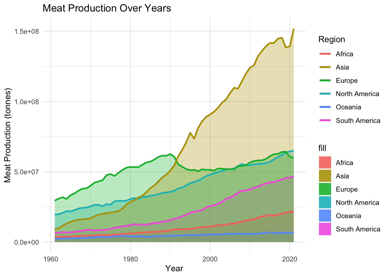
#Staticggplot(df, aes(x = year)) +geom_ribbon(aes(ymin =0, ymax = Africa_meat_production, fill ="Africa"), alpha =0.3) +geom_ribbon(aes(ymin =0, ymax = Oceania_meat_production, fill ="Oceania"), alpha =0.3) +geom_ribbon(aes(ymin =0, ymax = South_America_meat_production, fill ="South America"), alpha =0.3) +geom_ribbon(aes(ymin =0, ymax = North_America_meat_production, fill ="North America"), alpha =0.3) +geom_ribbon(aes(ymin =0, ymax = Europe_meat_production, fill ="Europe"), alpha =0.3) +geom_ribbon(aes(ymin =0, ymax = Asia_meat_production, fill ="Asia"), alpha =0.3) +geom_line(aes(y = Africa_meat_production, color ="Africa"), size =1) +geom_line(aes(y = Oceania_meat_production, color ="Oceania"), size =1) +geom_line(aes(y = South_America_meat_production, color ="South America"), size =1) +geom_line(aes(y = North_America_meat_production, color ="North America"), size =1) +geom_line(aes(y = Europe_meat_production, color ="Europe"), size =1) +geom_line(aes(y = Asia_meat_production, color ="Asia"), size =1) +labs(title ="Meat Production Over Years",x ="Year",y ="Meat Production (tonnes)",color ="Region") +theme_minimal()
Warning: Using `size` aesthetic for lines was deprecated in ggplot2 3.4.0.
ℹ Please use `linewidth` instead.
The meat production in several big targeting countries
Rows: 14140 Columns: 4
── Column specification ────────────────────────────────────────────────────────
Delimiter: ","
chr (2): Entity, Code
dbl (2): Year, Meat

ℹ Use `spec()` to retrieve the full column specification for this data.
ℹ Specify the column types or set `show_col_types = FALSE` to quiet this message.
Code
#View(global_meat_production)China <- global_meat_production |>filter(Entity =="China")United_States <- global_meat_production |>filter(Entity =="United States")India <- global_meat_production |>filter(Entity =="India")United_Kingdom <- global_meat_production |>filter(Entity =="United Kingdom")Sri_Lanka <- global_meat_production |>filter(Entity =="Sri Lanka")Macao <- global_meat_production |>filter(Entity =="Macao")Saint_Vincent <- global_meat_production |>filter(Entity =="Saint Vincent and the Grenadines")df2 <-data.frame(year = China$Year, China_meat_production = China$Meat,United_States_meat_production = United_States$Meat,India_meat_production = India$Meat,United_Kingdom_meat_production = United_Kingdom$Meat,Sri_Lanka_meat_production = Sri_Lanka$Meat,Macao_meat_production = Macao$Meat,Saint_Vincent_meat_production = Saint_Vincent$Meat)df_long2 <-melt(df2, id.vars ="year")# Create an interactive line chartp <-plot_ly(data = df_long2, x =~year, y =~value, color =~variable, type ='scatter', mode ='lines+markers') %>%layout(title ="Interactive Meat Production Over Years",xaxis =list(title ="Year"),yaxis =list(title ="Meat Production (tonnes)"))# Display the plotp
Rows: 13810 Columns: 4
── Column specification ────────────────────────────────────────────────────────
Delimiter: ","
chr (2): Entity, Code
dbl (2): Year, Meat, beef and buffalo | 00001806 || Production | 005510 || t...

ℹ Use `spec()` to retrieve the full column specification for this data.
ℹ Specify the column types or set `show_col_types = FALSE` to quiet this message.
Code
# Assuming your data frame is named 'beef_data'# Filter rows without NA valuesfiltered_data <-na.omit(beef_and_buffalo_meat_production_tonnes)# Install and load necessary packages# install.packages(c("plotly", "maps", "rworldmap"))library(plotly)library(maps)
Attaching package: 'maps'

The following object is masked from 'package:purrr':

    map
Code
library(rworldmap)
Loading required package: sp
### Welcome to rworldmap ###
For a short introduction type :      vignette('rworldmap')
Code
library(viridis)
Loading required package: viridisLite

Attaching package: 'viridis'

The following object is masked from 'package:maps':

    unemp
Code
# Create an interactive world map plotfig <-plot_ly(data = filtered_data, type ='choropleth', locations =~Code, locationmode ="ISO-3", z =~`Meat, beef and buffalo | 00001806 || Production | 005510 || tonnes`,color =~`Meat, beef and buffalo | 00001806 || Production | 005510 || tonnes`, colors =viridis(20), # Use viridis colorshovertext =~paste("Country: ", Code, "<br>Year: ", Year, "<br>Beef Production: ", `Meat, beef and buffalo | 00001806 || Production | 005510 || tonnes`),animation_frame =~Year,colorbar =list(title ='Beef Production'))# Display the plotfig
Rows: 12360 Columns: 9
── Column specification ────────────────────────────────────────────────────────
Delimiter: ","
chr (2): Entity, Code
dbl (7): Year, Meat, poultry | 00002734 || Food available for consumption | ...

ℹ Use `spec()` to retrieve the full column specification for this data.
ℹ Specify the column types or set `show_col_types = FALSE` to quiet this message.
Code
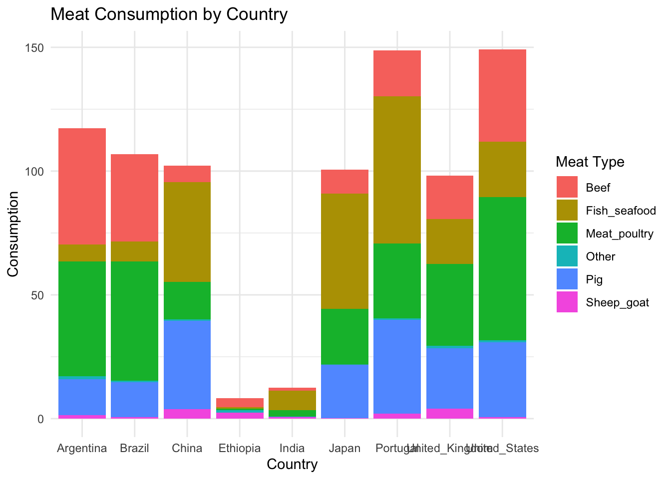
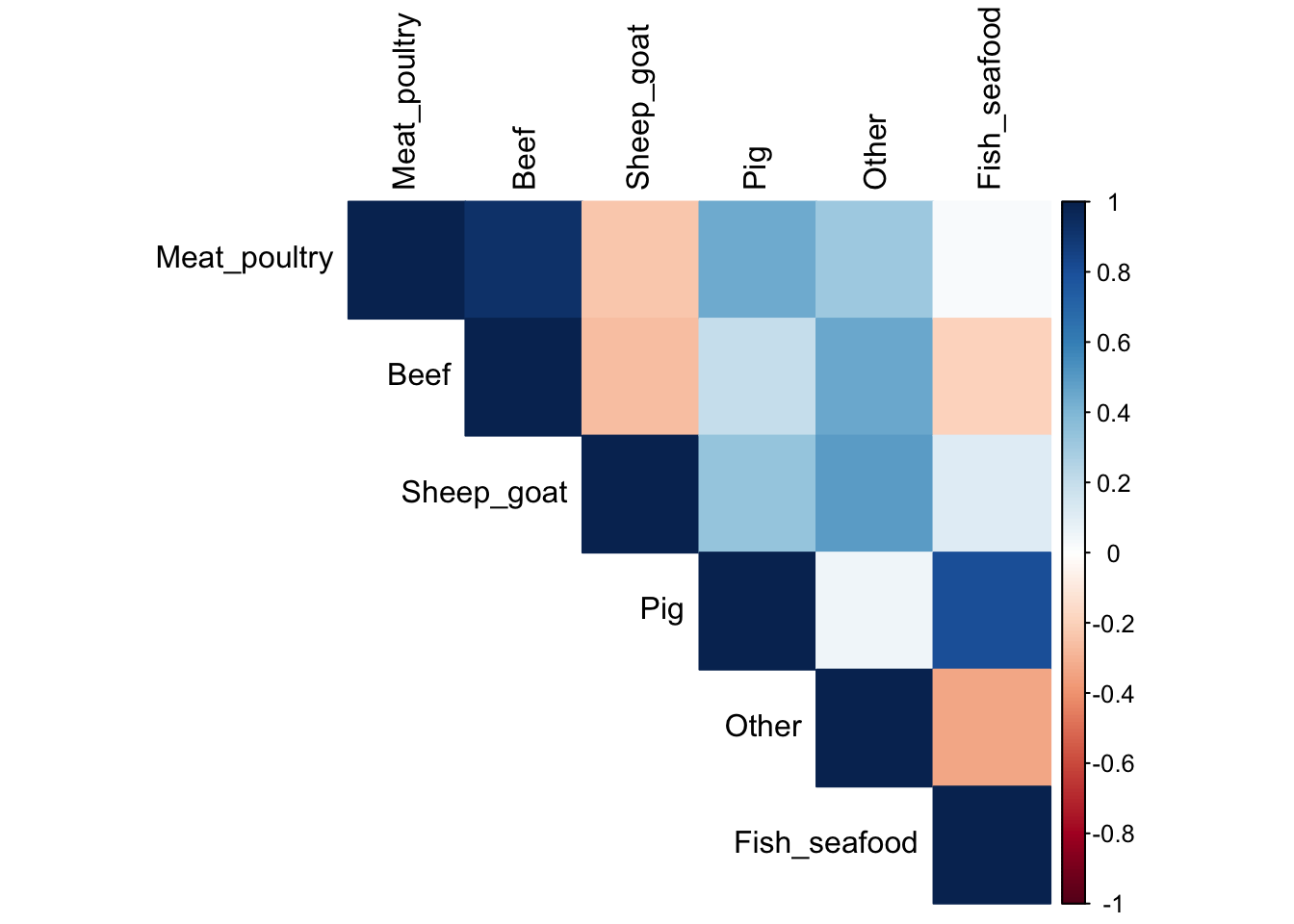
heatmap_data <- per_capita_meat_type|>rename(Meat_poultry ="Meat, poultry | 00002734 || Food available for consumption | 0645pc || kilograms per year per capita")heatmap_data<- heatmap_data|>rename(Beef ="Meat, beef | 00002731 || Food available for consumption | 0645pc || kilograms per year per capita")heatmap_data<- heatmap_data|>rename(Sheep_goat ="Meat, sheep and goat | 00002732 || Food available for consumption | 0645pc || kilograms per year per capita")heatmap_data<- heatmap_data|>rename(Pig ="Meat, pig | 00002733 || Food available for consumption | 0645pc || kilograms per year per capita")heatmap_data<- heatmap_data|>rename(Other ="Meat, Other | 00002735 || Food available for consumption | 0645pc || kilograms per year per capita")heatmap_data<- heatmap_data|>rename(Fish_seafood ="Fish and seafood | 00002960 || Food available for consumption | 0645pc || kilograms per year per capita")heatmap_data<- heatmap_data|>select(-Code) |>select(-Entity) |>filter(Year ==2020) |>select(-Year) |>as.matrix()heatmap(heatmap_data[,-1])
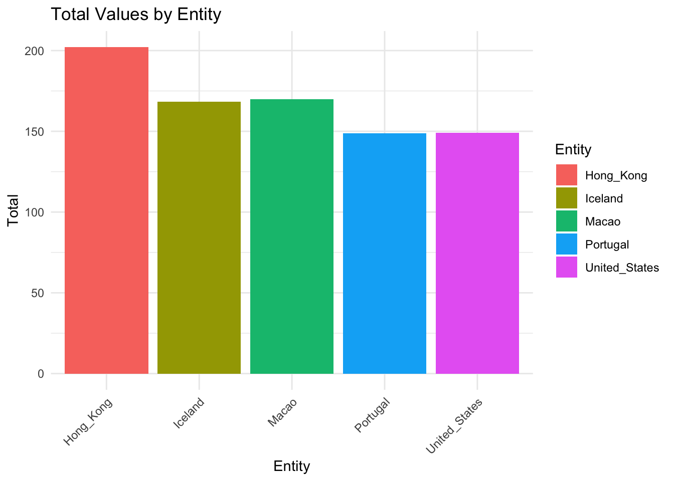
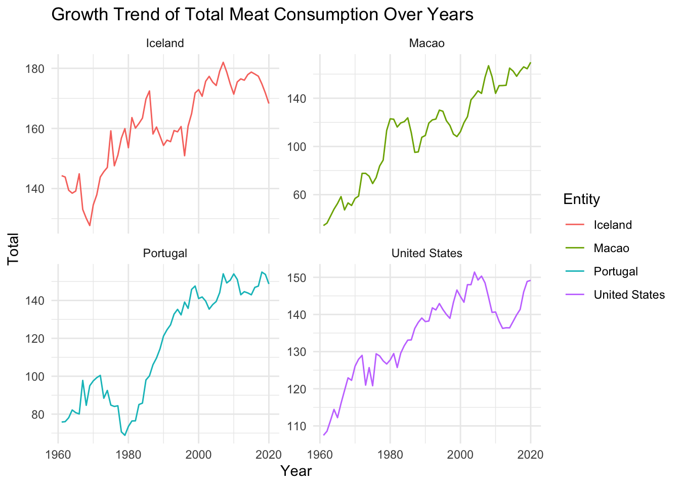
Top five meat consumption entity
Code
another_data2 =read.table(text ="Entity total1 Hong_Kong 202.022892 Macao 169.803333 Iceland 168.283224 United_States 149.183815 Portugal 148.68036", header =TRUE)ggplot(another_data2, aes(x = Entity, y = total, fill = Entity)) +geom_bar(stat ="identity") +labs(title ="Total Values by Entity",x ="Entity",y ="Total") +theme_minimal() +theme(axis.text.x =element_text(angle =45, hjust =1)) # Rotate x-axis labels for better readability
Top five region meat consumption static
Code
another_data <- per_capita_meat_type|>select(-Code) |>filter(Entity =='Hongkong'| Entity =='United States'| Entity =='Iceland'| Entity =='Macao'| Entity =='Portugal')another_data<-another_data|>rename(Meat_poultry ="Meat, poultry | 00002734 || Food available for consumption | 0645pc || kilograms per year per capita")another_data<-another_data|>rename(Beef ="Meat, beef | 00002731 || Food available for consumption | 0645pc || kilograms per year per capita")another_data<-another_data|>rename(Sheep_goat ="Meat, sheep and goat | 00002732 || Food available for consumption | 0645pc || kilograms per year per capita")another_data<-another_data|>rename(Pig ="Meat, pig | 00002733 || Food available for consumption | 0645pc || kilograms per year per capita")another_data<-another_data|>rename(Other ="Meat, Other | 00002735 || Food available for consumption | 0645pc || kilograms per year per capita")another_data<-another_data|>rename(Fish_seafood ="Fish and seafood | 00002960 || Food available for consumption | 0645pc || kilograms per year per capita")# Assuming 'your_data' is your data frameanother_data <-replace(another_data, is.na(another_data), 0) |>mutate(total = Meat_poultry + Beef + Sheep_goat + Pig + Other + Fish_seafood)ggplot(another_data, aes(x = Year, y = total, group = Entity, color = Entity)) +geom_line() +labs(title ="Growth Trend of Total Meat Consumption Over Years",x ="Year",y ="Total") +theme_minimal() +facet_wrap(~Entity, scales ="free_y")
Top five region meat consumption interactive
Code
library(plotly)# Assuming 'another_data' is your data frameplot_list <-lapply(unique(another_data$Entity), function(entity) { subset_data <- another_data[another_data$Entity == entity, ]plot_ly(subset_data, x =~Year, y =~total, type ="scatter", mode ="lines", name = entity) %>%layout(title =paste("Growth Trend of Total Meat Consumption Over Years -", entity),xaxis =list(title ="Year"),yaxis =list(title ="Total"))})subplot(plot_list, nrows =length(unique(another_data$Entity)), margin =0.05)
Some of the findings:
The world meat consumption total amount is increasing in the past 50 years, and for each sub category of the meat, like fish, beef, poultry, they are all increasing. There is no clear correlation between the different types of meat consumption amount. And in the world, US, China, Brazil has the highest beef production amount. In our comprehensive exploration of global meat production over the past 50 years reveals a fourfold increase in total output since 1961. Asia has emerged as the leading contributor, accounting for 40-45 percent of the world’s meat production, marking a significant shift from the dominance of Europe and North America in 1961. Despite a decline in production share, both Europe and North America witnessed substantial absolute increases in meat output, while Asia’s production soared by an astounding 15-fold.
The analysis also underscores the dynamic shifts in meat types, with poultry’s share tripling to approximately 35 percent by 2013, while the share of beef and buffalo meat nearly halved to around 22 percent. Pigmeat’s share remained relatively constant at 35-40 percent. These findings underscore the evolving landscape of global meat production, reflecting changes in regional contributions and shifts in preferences for specific meat types over the past five decades.